DESCRIPTION
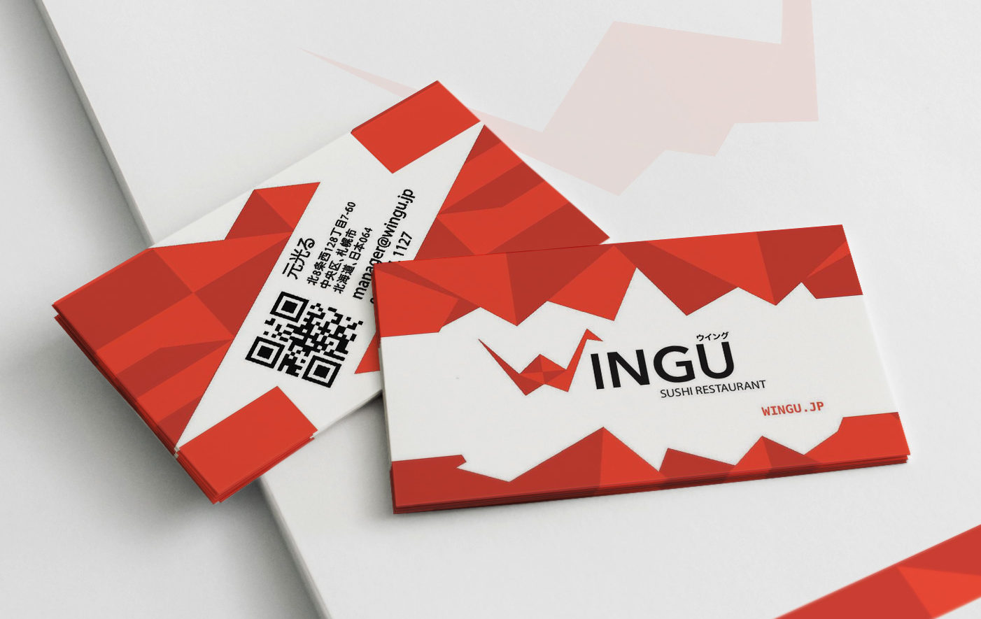
A personally created logo used onto a designed letterhead and business card.
Process (Programs, Tools, Skills): Using illustrator, I created a new logo, then I copied the logo into three separate artboards, one at 8.5 x 11in, and two at 3.5 x 2in. When I started creating my design for my letterhead and business card I moved my logo to the side. I then played around with the shapes builder tool and structure the main frame design of the letterhead. Once it looked like a letterhead and all the information was in, I incorporated my logo once in the top and one stretched to be a centerpiece. I reduced the opacity of the centerpiece, so it could be possible to write on. I also added a little accent on the bottom to give it a little depth. For my business card, in the front, I used my logo and reshaped around the card to make a design. I then freed it up with a white rectangle so it would have open white space instead of trapped. I then cleaned it off with a clipping mask. For the back, I created the design from parts of the logo, then deleted some specific parts of it to make room for the information. I then finished it by incorporating a QR code.
Message: This Japanese sushi restaurant wants to express that they are clean and have a unique style to them; a little bit of modern and a little bit of fanciness.
Audience: To those who wants authentic sushi and Japanese food. Also interested in modern style of the place.
Top Thing Learned: I really struggled to make things clean and not busy when trying to put all the information into it.
Color scheme and color names: Monochromatic: Red
Title Font Name & Category: Avenir Next: San Serif
Copy Font Name & Category: Menlo: San Serif
LETTERHEAD
BUSINESS CARD


