[et_pb_section admin_label=”section”][et_pb_row admin_label=”row”][et_pb_column type=”4_4″][et_pb_post_title admin_label=”Post Title” title=”on” meta=”off” author=”on” date=”on” categories=”on” comments=”on” featured_image=”off” featured_placement=”below” parallax_effect=”on” parallax_method=”on” text_orientation=”left” text_color=”dark” text_background=”off” text_bg_color=”rgba(255,255,255,0.9)” module_bg_color=”rgba(255,255,255,0)” title_all_caps=”off” use_border_color=”off” border_color=”#ffffff” border_style=”solid”] [/et_pb_post_title][et_pb_text admin_label=”Text” background_layout=”light” text_orientation=”left” use_border_color=”off” border_color=”#ffffff” border_style=”solid”]
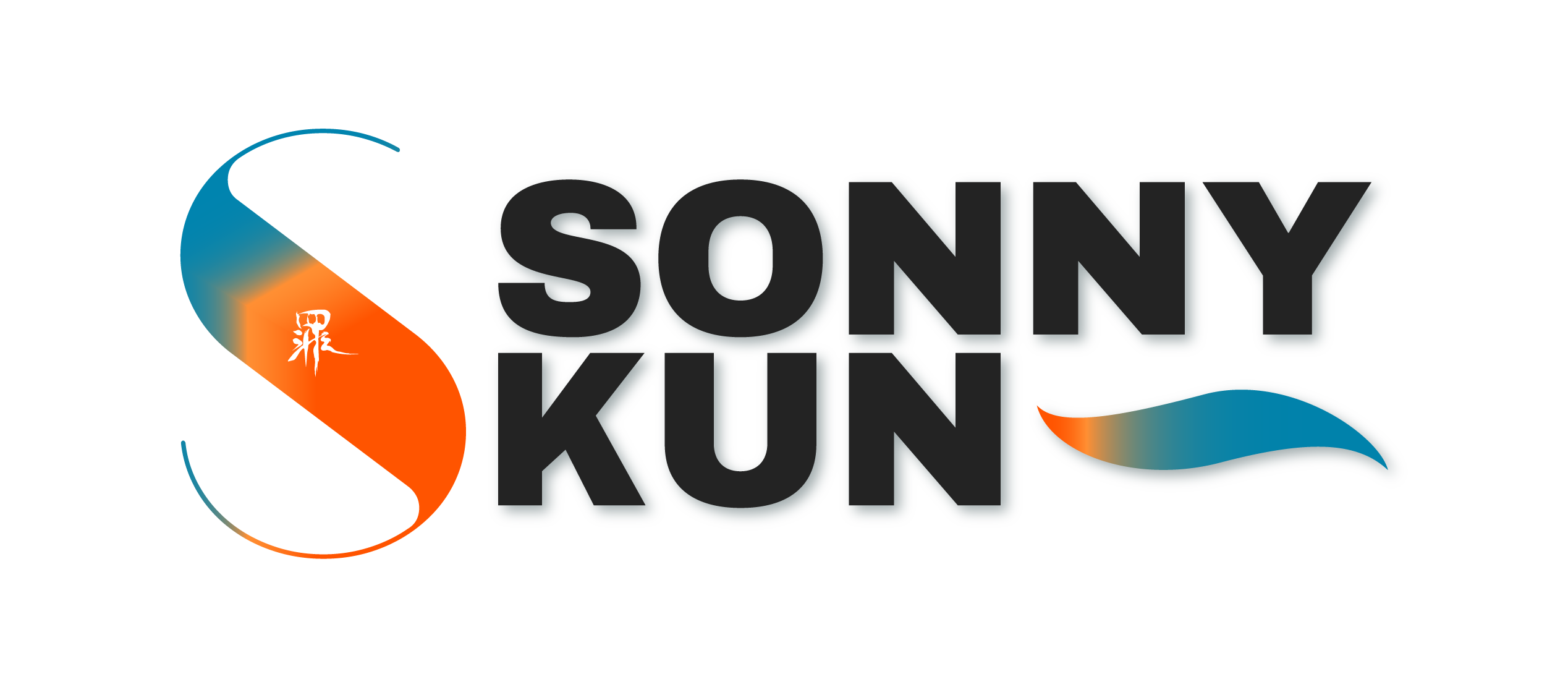
The goal of this project is to create a personal brand mark that I would be use for personal works as well as career. The brand would be used on my other projects, website, social media, etc.
The requirements of this project includes:
- 2 brand marks
- to be refined and professional.
- All vector based.
- One or more none-type based elements.
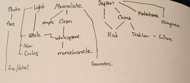
MINDMAP
FIRST BRAND
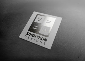
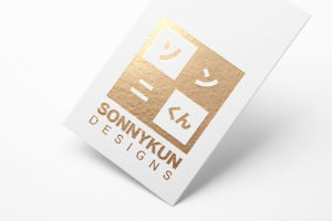
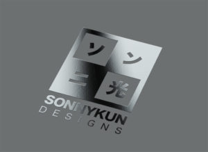
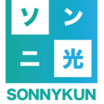
The first brand mark represents me and my design through its minimalistic style. Just simple and clean, which is how my designs tend to look like. I usually don’t stray too far from one or two colours and almost always use accents of black or white within my designs. I usually use shapes as focus as well. In the design, I wanted inner contrast so it wouldn’t look too boring. The first three characters that I used are the katakana form of Sonny (sohn-nee) and the last one is hikari or light which is the meaning of my name. If I were change I might change the light character to kun which is a used for youthful males and females, but mostly male.
SECOND BRAND
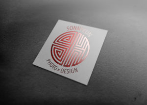
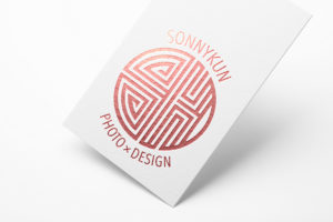
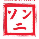
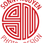
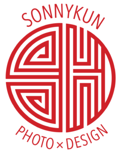
The second brand mark I represented me of my ethnical background. Coming from a more East-oriented background I somehow fall back to my roots in my designs. Sometime being to “Asian” in designs is a fallback especially from specific employers, but I want to find a workplace that does not see as a drawback, but as an extra pointer being culturally influenced. The design is related to the Chinese characters used on gates, stamps, prints, forms of signatures, which I felt is right there with identity. I also used the abbreviated form of sonny-kun, the s and the k.
Of the two, I believe the first brand mark is something that is more balanced with my personal-self and my designs. I still would like explore more with the colour, but as for now I believe I can call this my identity.
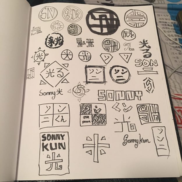
On this project, it was incredibly hard trying to make a design that wasn’t so oriental, but I just gave and accepted the fact that it is meant to be. I also struggled with designing on paper. I also feel like it would look good until digital. Surprisingly, some of my poor sketches actually became my final design.
SKETCHES
RESULTS

MOCKUPS
OTHER DIGITAL VERSIONS
CONCLUSION
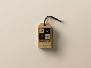
In the end, I came to see that checker style logo is my favourite and I feel it expressed both my minimalistic-ness as well as my Asian-esque style. The mock-up really helped me had an almost real-life visualisation of my design and I would say it does look good, clean, and simple. I hope it will become something people would be able to see and easily remember it visually and mentally.
[/et_pb_text][/et_pb_column][/et_pb_row][et_pb_row admin_label=”Row”][et_pb_column type=”2_3″][/et_pb_column][et_pb_column type=”1_3″][/et_pb_column][/et_pb_row][/et_pb_section]
